Burt’s Bees Rebrand
Visual Identity
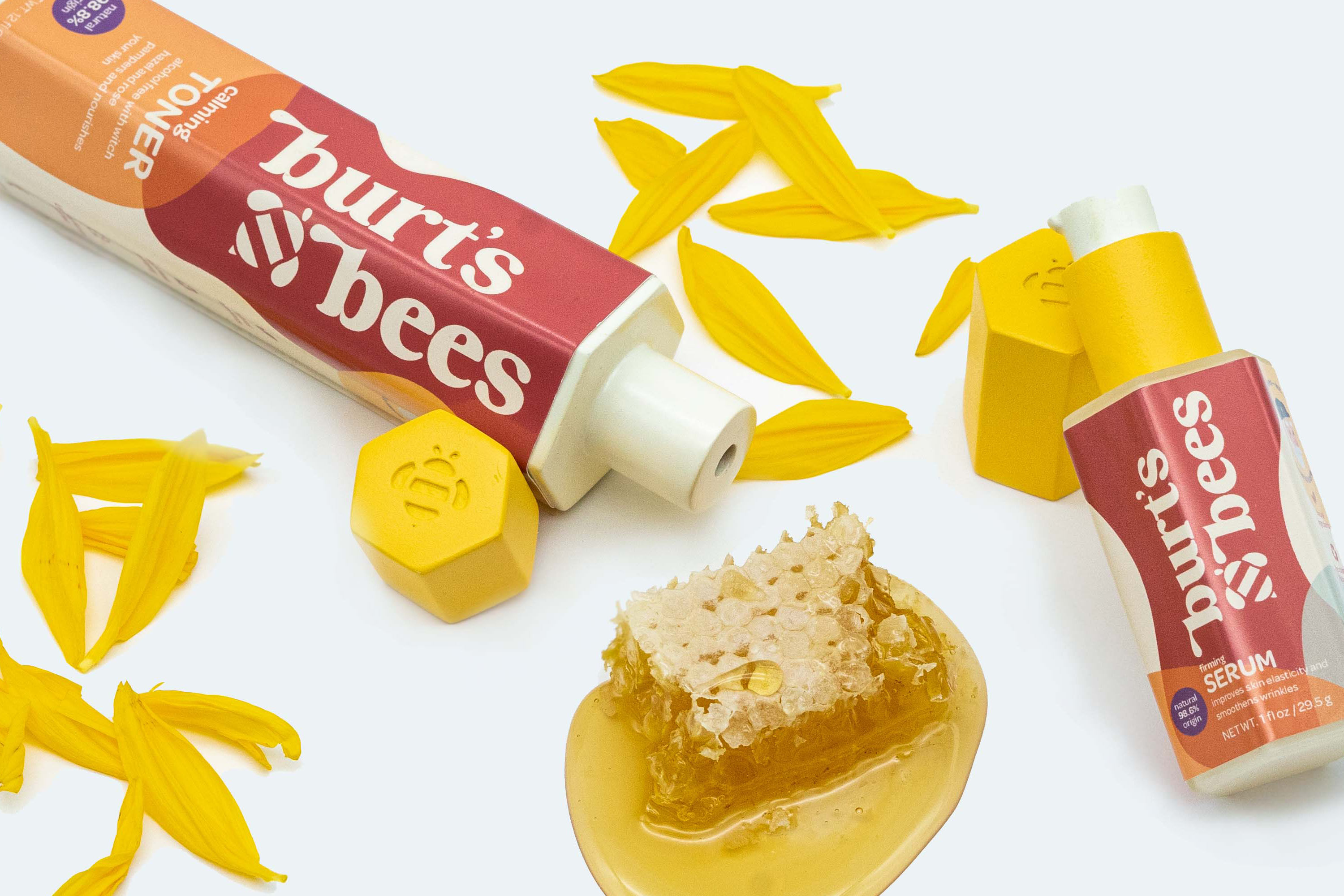
Package Design
Retail Application
Inspired by the viscosity of honey, nature of bees, and the effectiveness of honeycombs, the modernized and comprehensive relaunch of Burt’s Bees’s skincare line is designed to take up the least amount of space possible at home, in shelf, and during shipping.
Keywords
Clean, Responsible, Natural, Fun
Logo
To add more character onto the products, the logo reflects of the viscosity of honey in a more optimistic and relatable tone.
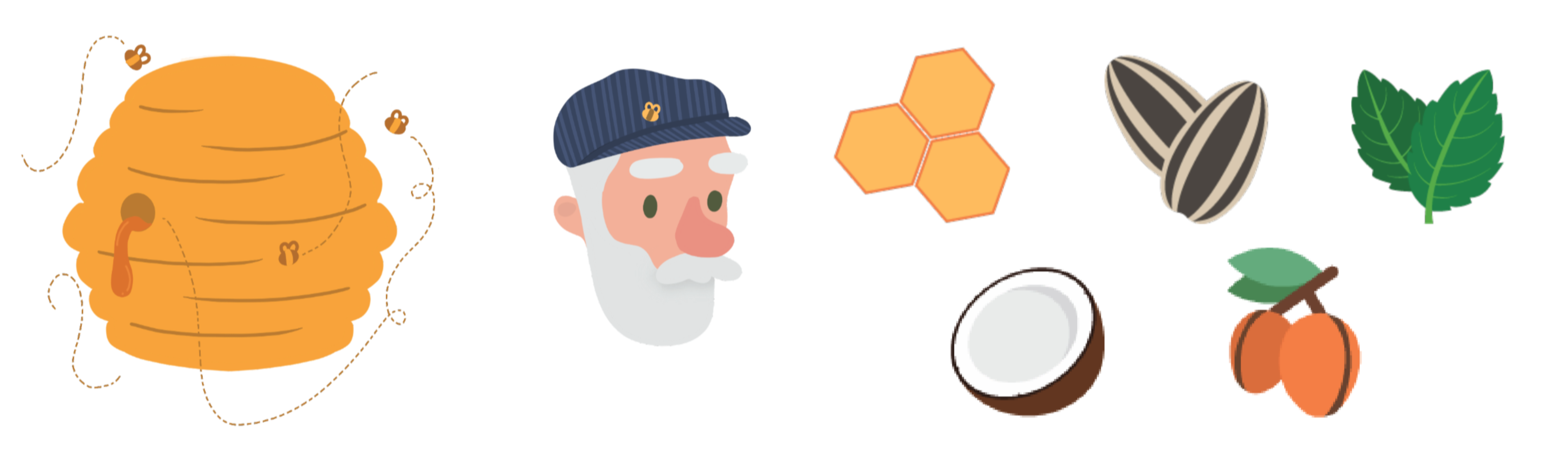
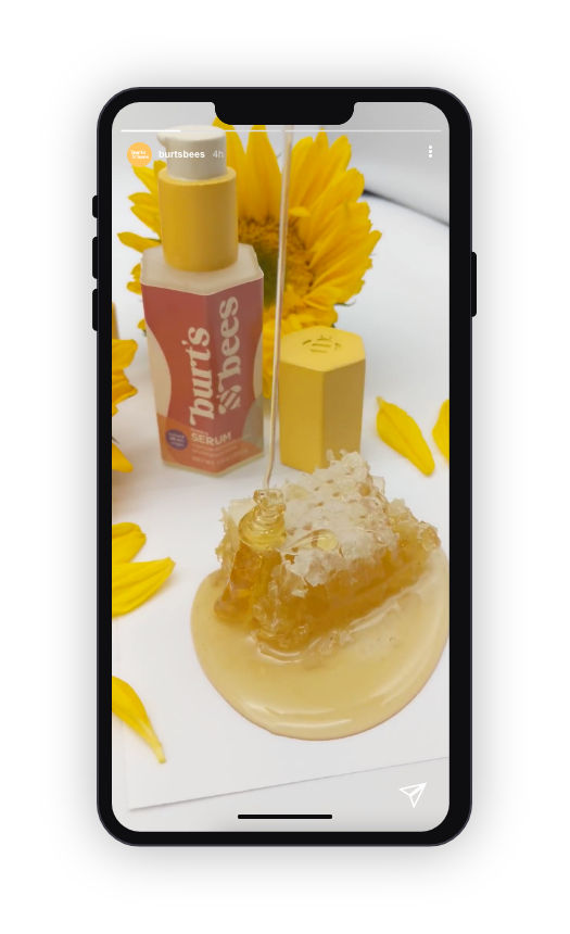
Illustration and Graphic Elements
The illustrations allow the new design to have a more upbeat and relatable tone that speaks to the younger generation.

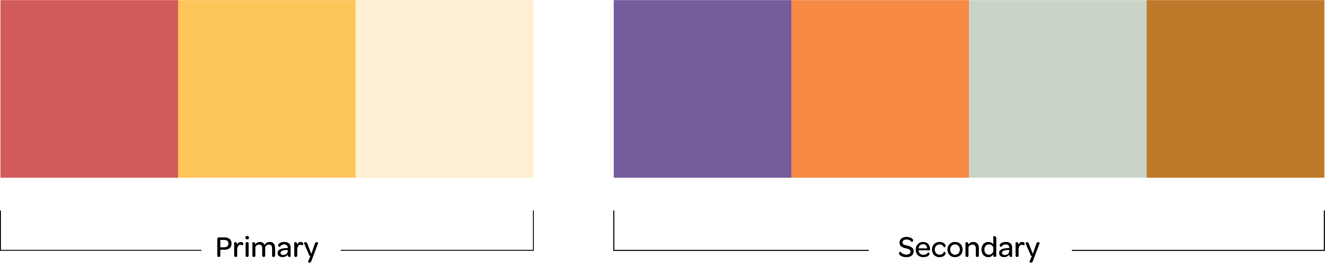
Color Palette and Inspiration
To keep the brand colors familiar, the color palette stems from Burt’s existing yellow and red with an addition of other colors inspired by the various colors of honey and flowers.

Complete Family Lineup and Form Inspiration
The forms are inspired by honeycombs and how hexagonal shapes are one of the most efficient shapes in nature. This allows the forms to nestle with each other when stored.


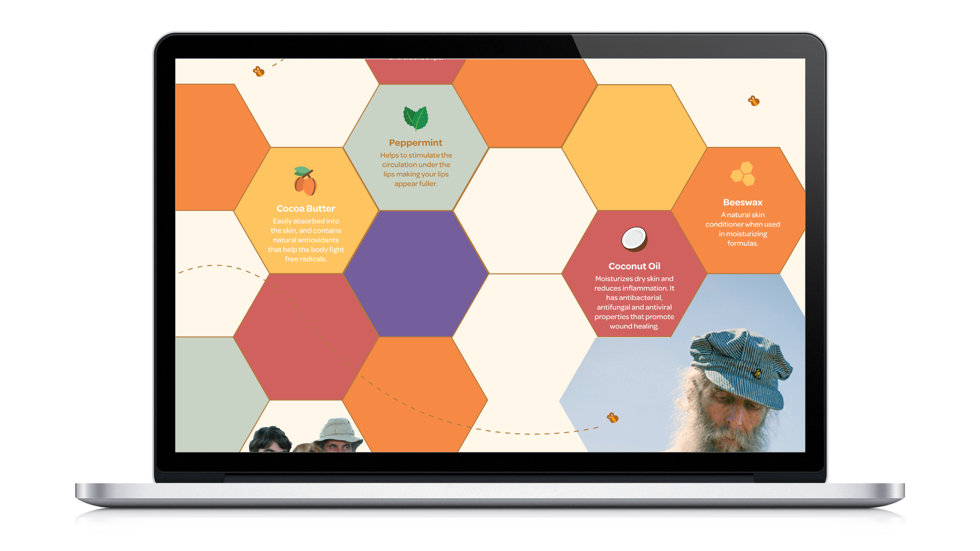
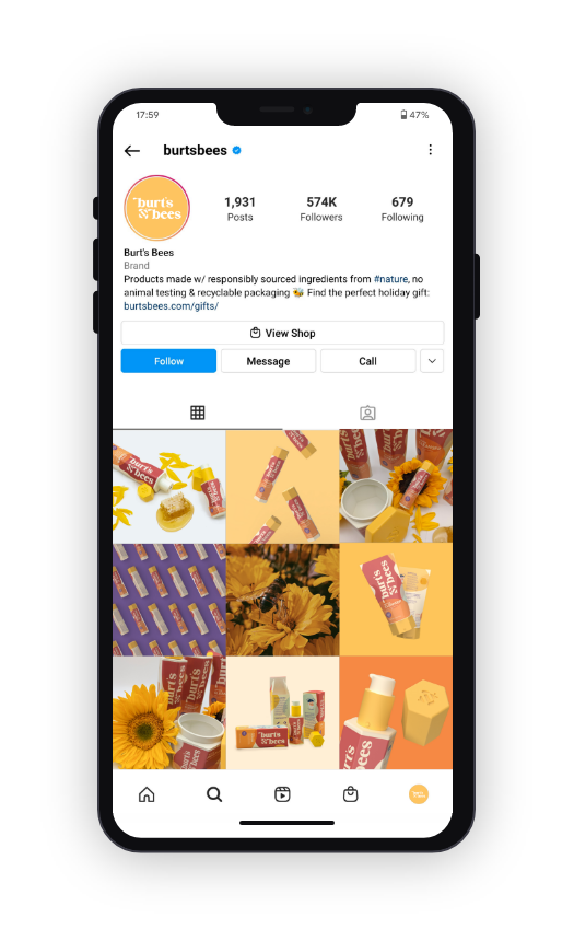
Website and Social Media
The improved website introduces the products and allows users to browse through the products provided as well as learn more about Burt’s history.


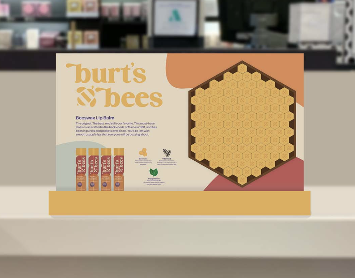
Countertop Display
The countertop display introduces the lip balm to a retail setting. Influenced by the nature of honeycombs, the display allows customers to play around with creating their own rendition of a honeycomb.

One of the most inspirational parts of the process was learning about how nature always strives to use the most minimal amount of space and energy. It’s a practical experience shared with the user through the fun and exciting packaging.